Introduction
Have you ever wondered why some websites convert visitors into users effortlessly while others struggle to keep them engaged? One of the most powerful tools for understanding user behavior is heatmap analysis. In this case study, I’ll walk you through how I used heatmaps to improve user engagement on CryptoSmartlife, an AI-powered crypto investment platform.
By applying a data-driven approach, we were able to increase click-through rates (CTR) by 25% and session duration by 15%. Let’s dive into the process!
The Problem: Low Engagement & Conversion Rates
CryptoSmartlife offers thematic crypto investment baskets, making it easy for users to invest without needing multiple exchange accounts. However, despite a sleek design, the platform faced low user interaction with key elements such as the call-to-action (CTA) buttons and investment features.
Symptoms of Low Engagement:
- Low CTR on CTAs (Invest Now, Learn More)
- High Bounce Rate (Users leaving quickly)
- Short Session Duration (Users not exploring the site deeply)
We needed to identify friction points and optimize the user experience to improve engagement.
Solution: Heatmap Analysis & Optimization
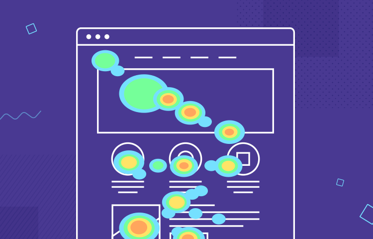
To understand where users were clicking, scrolling, and dropping off, I implemented heatmap tracking on the CryptoSmartlife platform. The goal was to identify patterns and optimize elements for better engagement.
Step 1: Analyzing User Behavior with Heatmaps
Heatmaps provided clear insights:
- CTA buttons weren’t attracting enough attention – The primary CTAs were getting fewer clicks than expected.
- Users weren’t scrolling past the fold – Important information about investment benefits was going unnoticed.
- Non-clickable elements confused users – Users frequently hovered over images that weren’t interactive, leading to frustration.
Step 2: Data-Driven Design Improvements
Based on heatmap insights, we made the following adjustments:
✅ Enhanced CTA Visibility:
- Increased button size and added a high-contrast color to improve click-through rates.
- Placed the primary CTA above the fold, ensuring users saw it immediately.
✅ Restructured Content Layout:
- Moved key benefits and investment options higher on the page.
- Reduced text-heavy sections and added visuals to improve scannability.
✅ Improved User Navigation:
- Added clickable elements where users naturally hovered.
- Created an intuitive flow for users to explore different investment baskets.
The Results: Higher Engagement & Conversions
Post-implementation, we saw significant improvements in user interaction:
- Click-Through Rate (CTR) increased by 25% – More users engaged with the CTA buttons.
- Session Duration increased by 15% – Users stayed longer, exploring investment options.
- Bounce Rate decreased by 10% – Fewer users left immediately after landing on the page.
Key Takeaways: How You Can Use Heatmaps to Improve Your Website
If you're struggling with low engagement on your website, here’s how you can apply heatmap analysis:
1️⃣ Identify user pain points – Find out where users are getting stuck or losing interest. 2️⃣ Optimize CTAs and content placement – Ensure important elements are visible and compelling. 3️⃣ Test and iterate – Continuously analyze and improve based on data.
By leveraging heatmaps, you can remove guesswork and make data-backed decisions to improve user experience and conversions.
Final Thoughts
Heatmap analysis is a game-changer for understanding user behavior and optimizing digital experiences. My experience with CryptoSmartlife reinforced the value of a data-driven approach to UX improvements.
If you're looking to enhance your website’s engagement, consider implementing heatmaps today!
Let's Connect